Summary
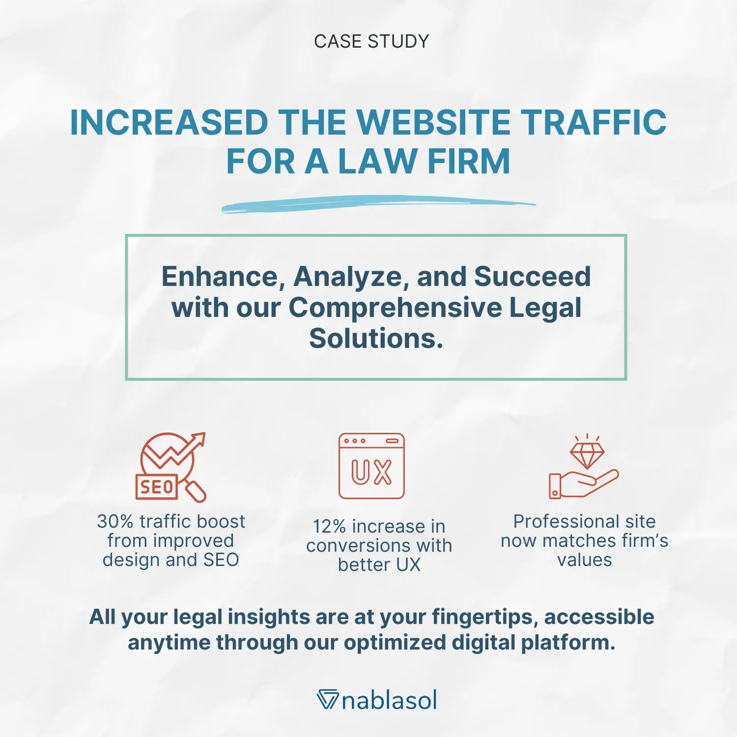
The law industry in the United States of America is a highly competitive market. The customer carries out in-depth due diligence before choosing their lawyers. Our client was a law firm, unable to generate enough traffic to their traditional website and get leads for their business. A business only survives when they have a good continuous flow of customers and subsequent conversions. We helped the company improve its SERP ranking and decrease the bounce rate by optimizing the website. As a result, we saw a 30% increase in website traffic and 12% in website conversion rate. Here’s a case study on how we did this.
Client Overview
Our client is a law firm based out of The United States of America, engaged particularly in various litigation and defense strategies. They provide specialization in immigration law, criminal defense, family law, personal injury cases, and employment law. The dedicated team is developing highly effective defense strategies to protect their client’s freedom and reputation.
Business Challenges
The firm’s customers are HNIs who wished to seek the right service without investing much time in the portal. The challenge here was to cater to the consumer pain points at each of the steps in the journey, from showcasing the page on the Search Engine Result Page (SERP) to the Call-To-Action for booking the service and everything in between without the client bouncing off to a competitive service provider. To summarize, the following were the pain points:
1. Get a more professional and visually appealing website designed which is an accurate representation of their values and practices
2. Create a better user-friendly website that provides a seamless experience to its Users
3. Design the website mobile friendly so that mobile users can get a great User Experience across the platforms
4. Design the website in consideration of SEO standards to increase search engine ranking. As a result, they can get more traffic and acquire more clients to their website.
5. Track every lead that comes on its website and convert it into a prospective client
Solution Provided
We collaborated with our clients to understand their requirements and objectives. We created a design positioned and organized to increase the consumer journey across the platform. We integrated the website with the analytic tools to understand the consumer dropout points and interaction zones. We analyzed heatmaps to understanding consumer behavior with the website. Based on our analysis, we took the following steps after making a case to the client:
- We optimized navigations so that users can get access to any of the pages throughout the website.
- We made the website mobile-friendly and compatible to adapt to the resolution size of all the smartphone devices. The website was designed based on the UI of the various screen sizes.
- We optimized the number of Call-To-Action to increase the number of conversions on the website throughout the sales-funnel
- We helped them with better URL page structure, page titles, meta descriptions. As a result, the website became more search engine friendly.
Impact on Business
- The overall presentation of the website became professional and attractive that would suit the targeted audience.
- Website responsiveness increased by reducing the content loading time by optimizing the data loaded on the front end.
- It not only increased the traffic to the website by 30% but increased the CTA conversion by 12% due to SEO-curated content.
